MIB:
How I was able to negotiate and rethink compliance and unraveling years of process debt
I designed and executed everything in 3 weeks, including:
Advocacy to challenge compliance measures, Information architecture and workflow schemas, Hi-fidelity screens/content/interaction design
The problem, or: what the heck is an "MIB"?
Got rejected for life insurance for being a smoker? Why not just go to another insurance company and lie this time?
The insurance industry has an immune system set up for fraud like this: MIB, or formerly, the Medical Information Bureau. A private consumer reporting corporation exclusively for insurance applications, and it prevents fraud by amassing a database of insurance applicants' information from all its participating companies to ensure applicants don't apply with fabricated information.
But this activity is very time consuming and, the Northwestern Mutual Underwriting team is heavily overwhelmed by their backlog. The question that the product team and myself asked is: how we design a better MIB feature to save them precious time and contribute to a better overall Underwriting process?
"Our exclusive Code Solutions enable underwriters to:
Identify possible applicant misrepresentations or omissions
Uncover potential over-insurance situations
Monitor ongoing applicant activity enabling a second chance for review during the contestable period"
What did this used to look like? Or: Something is off
The crux of MIB work is based around MIB codes:
A series of alphanumeric prefixes and suffixes
Represents medical conditions or high-risk activities that can impact health or life expectancy
Each code is tied to a specific set of conditions, and entered into and referenced from an external MIB database
When we first started, I encouraged the other designer on the team to slow down and look deeper instead of jumping into screens, as something didn't feel right.
The MIB component taking up its own page and flow is strange because Underwriters were responsible for the following for EACH insurance policy they underwrite:
Logging risks (eg. high blood pressure, tobacco use, enjoys jumping out of planes)
Referencing the MIB database to see if the applicant had any logged key factors, and register any that's missing
So if factor entry and MIB references are mechanically related, why was there a separate workflow? Why couldn't underwriters even look at the factors and the MIB codes together on the same page?
Digging yields more questions
After some conversation and learning, enlightening processes and issues emerged.
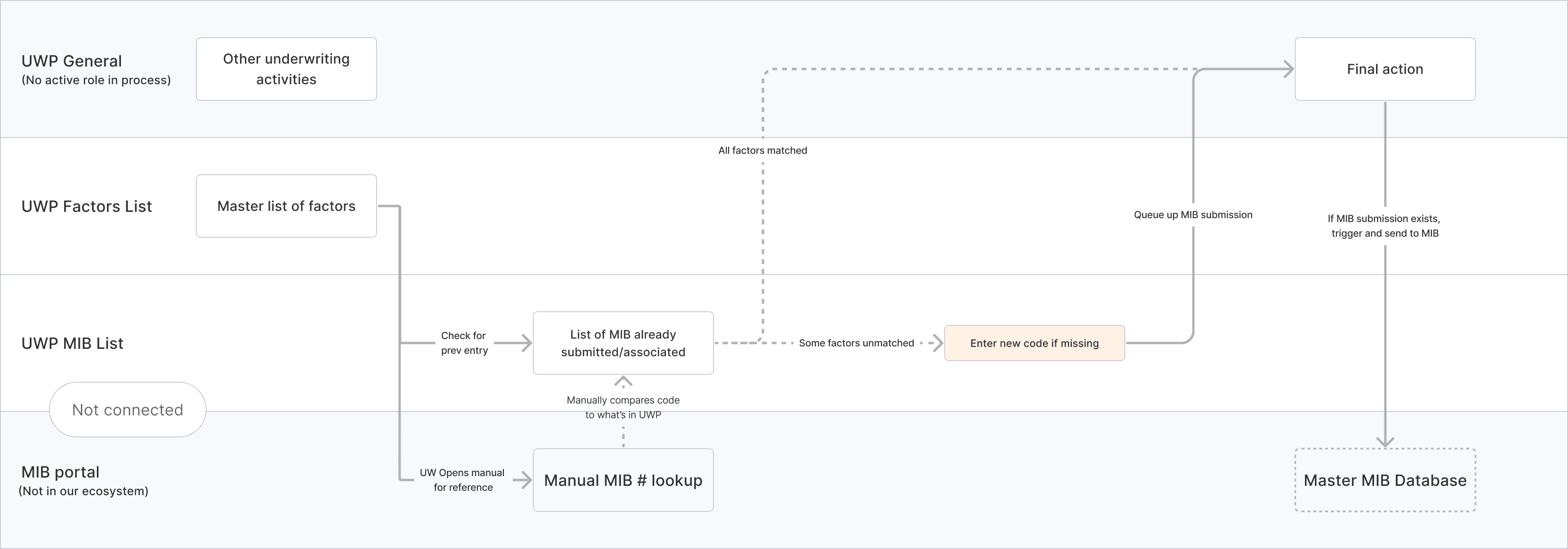
Underwriters actually have to manually navigate two systems simultaneously. For every single key risk, they have to open the MIB portal in one screen, do the lookup, cross reference it visually against the factors in the policy being underwritten, and then enter it into UWP without assistance to avoid typos, in order to eventually have it submitted into the MIB system.
I documented the workflow in a very simple diagram to make it clear for the team. This immediately begged the question: why do Underwriters have to go through these steps and jump across systems to do their work?
Breakthrough at the compliance level
The PMs revealed after some prodding that it's the MIB bureau itself that refuses to display the MIB codes on the same place on screen as the descriptions of what the code does. It’s apparently a compliance measure on their end.
I pointed out that eventually, if they reference the MIB database, they’re going to HAVE to display the MIB codes and their descriptions together regardless, the logic of the argument doesn't hold. I also suggested that we should make the case to MIB directly. After some negotiation, the product team agreed to facilitate a conversation between me and MIB themselves.
20 days: The time it took for MIB contacts’ schedule to open up
20 minutes: The time it took me to chat with, present to MIB, and for them to greenlight the V1 design concept
It turns out that the only thing upholding this constraint was just outdated conversations.
The MIB team only wanted to make sure that the code and the statuses they represented couldn't be easily visually skimmed by a passerby.
So instead of serving as a healthy guardrail, this metastasized into very convoluted rules and understanding in our system over time.
Smaller details and refinements
Once we got the green light. I repeatedly iterated on the designs, phasing out different card layouts based on our read of MIB parameters
Ultimately, I chose an option that hid the specific condition but making the status easier to scan regardless of horizontal or vertical layouts with minimal controls while retaining all the functionality.
I then redesigned with the product and dev team the card statuses and the backend logic in order to reflect new backend requirements arising from the new design.


