How I was able to help a thousand people learn how to use an enterprise product without training
I designed and executed everything in 3 weeks, including:
Information architecture, workflows, hi-fidelity screens/content/interaction design, all usability testing
First: the outcome
The internal work management product I designed saw incredible initial interest literally from the moment of launch. However, it wasn't perfect.
To help them get past a key novel workflow and way of working that the product relied on, I designed, tested, delivered an onboarding feature for the product in three weeks.
This onboarding made the product so easy to use that it led to the support team completely dropping basic training. This was a key contributor to the 85% 1st year voluntary adoption rate that the product enjoyed.
The problem: the rule builder
The rule builder: a familiar component to many people using email and other tools that requires ad hoc organization of high volumes of content. It's often used to organize high volume of content into different containers using logical rules that the users provide.
There's just one problem:
In this product, the rule builder is used as a required first step in the product, creating containers called "Views". And, the users are ALWAYS in a View.
This is the inverse of how most people would normally experience this in email, where you only *optionally* organize email into groups or folders.
This difference in usage caused confusion. We even spoke with users who could recognize how to use it on sight, but are still nervous about what it does.
This hesitation was overwhelmingly the most negative sentiment expressed by users when introduced to the product. It was the biggest piece of friction, if not blocker to adoption, in the entire application.
MVP over research
I focused on a MVP instead of more costly research, designing flows and screens with key principles in mind:
Be as short as possible, do not lose user attention
Force users to decide and pay attention when it counts
Educate in one step, then let them play (Big concept from game design)
Use visuals in a data-heavy space to help guide users through purpose and decisions
Usability testing revealed that people could generally go through the onboarding and understand what they were supposed to learn.
Good start, but opportunities for refinement existed:
Hiding next steps behind controls caused confusion
The language was too jargon-y and blunt
The playground/outcome had problematic visual design
The simple refinement
I tweaked the flow in a tiny but significant way, bringing the decision making and the outcome for user choices into the same screen and making the consequences of their choice apparent in real time. Improvements were also made to the screens themselves in visuals and content:
Out: excessive attempts at cleverness
In: revamped visualizations that uses actual team language to prime the users to think in the rule-builder logic
I also brought visual language in line with the rest of the product
This eases non-tech-savvy users in to figuring out how the rule-builder works, while placing no hinderance on power users who already know how to use the component.
Learn by playing
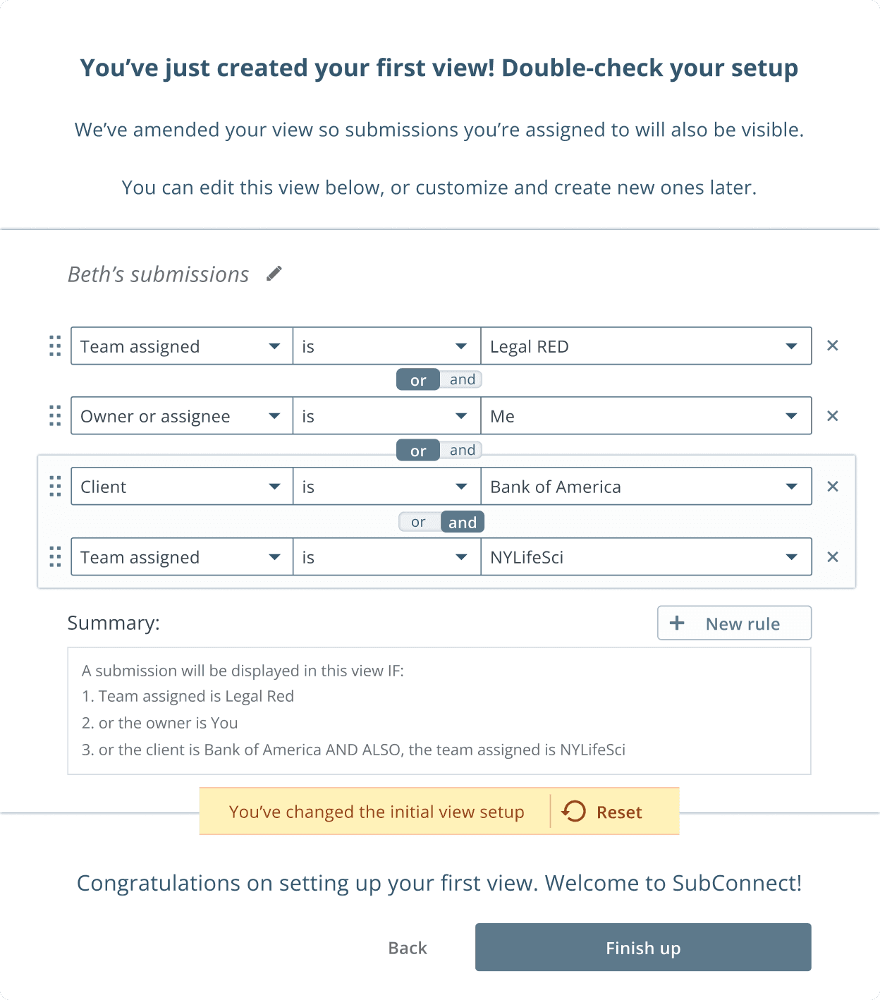
The importance of Play: Finally, once the user arrives at the confirmation page, the choice that the user made is rendered in an instance of the actual rule builder UI. A reset option offers the safety of a sandbox.
Included in this is a novel semantic summary design that helps users understand the impact of boolean logic (Here, the difference between AND vs. OR)
This provides the user with a completely safe and transparent way to experiment with the entire rule builder.
This onboarding feature is an example of several small feature MVPs I designed against the backdrop of a much larger, complex design. While not very complicated, it completely eliminated any inquiries about the rule builder views from newly onboarding team members.
The time we freed from our end users’ (and training team's) day by making something previously complex completely intuitive and require no training to use, made for a significant win and opened the floodgates for much faster adoption.


